Art/Design Magazines Archives
I guess I should give crappy mags a break... after all, you'll discover that a lot of the cooler looking magazines are made by rich kids. It's much easier to fight convention when you don't have to sell as many ads. However, there is a whole new genre of magazines that are partly conceived of as print, but with no cash, are intended for online viewing.
Check out Tiger, a " screen magazine" from Tokyo. Not terribly well planned out, yet still an intriguing selection of playful imagery. The "current" issue is from 2005. Somebody, anybody give these kids some money! Actually, give it to me.
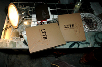 Last night I was making dinner at my house when I got a phone call about the LTTR issue #5 release party and show in progress around the corner. I shoved the few remaining brussel sprouts in my mouth, grabbed my camera, and ran over. Unfortch, I missed most of the entertainment, walking in during the last act: two cute kids singing a bad cover of U Got It Bad.
Positively Nasty, the 5th issue of queer feminist art journal LTTR, looks fantastic. Thick brown cardstock cover, spiral-bound, a plastic pouch of stuff inside. I'll write more about it once I actually get a copy and read it. The party was fun, but I wish I'd gotten there earlier. Was anyone else there? If you got there on time, tell us what we missed in the comments.
More photos after the jump...
Continue Reading LTTR
 When Index magazine folded this year a big hole opened up in publishing. Index was practically the only American art / entertainment / lifestyle (I'm not sure what category you'd call it, but you get the idea) magazine that didn't suck. They took over Interview's role (which ceased to be relevant about 15 years ago - some people would say 20) as the most cool interview magazine on the stands. They eschewed excessive cover-lines and trendy celebrity styling in favor of bold typefaces and bright uncluttered photography and layouts. They featured whoever they damn well pleased - people they liked, not just actors with a new movie coming out. It was intelligent and informative, yet playful and irreverent. Index could be read cover to cover without the reader being bombarded by irritating product placements and excessive adds. Index was more about being part of a community than being a marketing tool. There is nothing right now to take it's place. Fortunately the entire 10 year run of Index is online - check it out.
 Hello from my vacay in lovely San Francisco. I'm taking a break from driving around taking photographs and visiting pals to check email and look at my favorite websites. I got the new issue of Artkrush and it has a nice feature on alternative art publications. Check it out.
pictured: Spit Rainbow postcard by Melanie Schiff from North Drive Press #3.
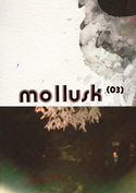 Mollusk #3
96 pages , 19 x 27 cm.
Limited edition 1000 ex.
After seeing an earlier post where we mention the Swedish/French artist duo Bongôut, a friend suggested we check out their magazine, Mollusk. I contacted them and they so nicely and promptly sent me some copies. Mollusk is an ad free art jounal that mostly shows full pages of work by artists from around the world. There is some text about the artists and some interviews in both English and French. This issue covers a wide range from an interview with G.G. Allin's brother Merle about his serial killer art collection to a French guy named Medhi Hercberg who makes cool drawings and sweatshirts. When I looked up Medhi's website, I saw that he's putting on a show with Eats Tapes, my friends from San Francisco. Small world! Other highlights from the issue are photographs by Solange Reboul, an article about German outsider artist Engelbert Kievernagel, and stencils by Polish group M-City.
Buy the magazine directly from Bongôut.
 Here are some links to a few full issues of awesome LA new wave magazine WET. This one is from 1981 and features side by side interviews with Johnny Rotten and a young David Lee Roth and some great stuff on xerox art. Plus the whole thing, even the ads, looks amazing. This page has two issues from 1978 up on their site. And this page has a cover gallery.
[from ryan, via boingboing]
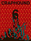 Craphound #6
Show & Tell Press
104 pages
Full size
B/W offset inside, color cover
I love Craphound. I can look at it for hours. Each issue has a theme and contains pages packed with scanned images culled from catalogues, obscure books, ads, and who knows where else. This one is about death, telephones, and scissors. The last one was hands, hearts, and eyes. Take a close look, savor it. It's smart, funny, hypnotic, and if you're into that sort of thing, full of tattoo ideas! Chloe from Reading Frenzy in Portland is now publishing Craphound and I hear issue 7 is in the works. The theme: Church and State.
Buy it at arty bookstores, or from Reading Frenzy, or Atomic Books.
For more information about Craphound and Sean Tejaratchi, check out this long review/interview in PingMag.
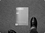 I ventured out in the freezing weather last night looking for something to look at. I was bored, I guess, and that rarely happens. I walked around Union Square but it was too cold to really see anything except my breath and my hair blowing in front of my eyes. I read magazines in Barnes and Noble for a while but sometimes being in there gives me the creeps and I didn't feel like having a Starbucks coffee and gross muffin. So I wandered over to Union Square Magazine Shop hoping to find some weird little mag tucked between the bigger ones. Big New York newsstands are good for that kind of thing—well-stocked and disorganized enough to harbor hidden treasures. And this time was no different. I left with a slim volume of Kasino A4, a black and white Finnish fashion/art rag with a nice purple cover. This issue also has a middle section printed in blue and white. It looks like it was made with a ditto machine. I've always wanted one of those. And this magazine kind of smells like that mimeograph smell. I love that. I'd say this is the best smelling magazine I've bought this month.
On the cover it says simply "Time to change." The unifying message of this issue seems to be slow down, take a good look around—at yourself, your home, your people, etc. I suppose that is appropriate for a Winter issue. Throughout the issue there is documentation of the mag's editors showing up at the apartments of artists they're profiling and cooking a meal with whatever that artist has in their kitchen while doing an informal interview. I love this too.
Their new issue is sold out from the site, but look for it at cool shops and newsstands. You can get back issues and posters and t-shirts from their site though.
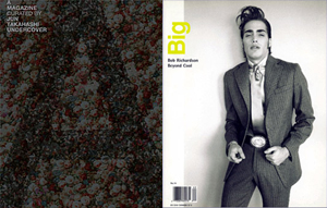 I love when magazines have guest editors, when they let a person or a collective curate the whole issue. Some of my favorite examples are: Big Magazine 15 by Bob Richardson had old and new photos by Bob, features on new designers he liked, photos by his son Terry Richardson, and old pics from Bob’s life, like a spread of him hanging out with a teenage Angelica Houston. The issue of A Magazine curated by Maison Martin Margiela had a white theme, began with this quote, "the past is what bonds us, the future leads us," and had pages by everyone who has ever collaborated in any way large or small with the fashion house.
Continue Reading Guest Editors
 Once a week or so I meet Mr. Mcginnis at Universal News for coffee and magazine browsing. We each grab a stack of titles we've never looked at or maybe haven't seen in a while and then sit down and discuss. There were a few highlights this Friday but nothing really blew me away. The only thing I was psyched about all through the issue was Lula, and that doesn't count because it wasn't a magazine I'd never bought before. More on that issue later. Here's what else I saw:
Encens: a French/English fashion magazine. I liked that most of the book was in black and white and that they used a few different kinds of paper. Also, did you know that LA fashion designer Rick Owens makes furniture now? I guess I've been a little out of the loop.
032c: a bi-annual German contemporary culture magazine with good articles but not the best feeling paper. I also liked the cover.
Very: a New York/London art and fashion mag that also publishes style guides to various cities. Glad to see they're still publishing. The best part about them has always been their great covers. The paper also feels good.
 Umbrella is a quarterly art journal that covers artists' books, mail art, and other multiple editions including audio and video works. They published a print version from 1978 to 2005 and then moved online. Indiana University-Perdue University Indianapolis' Library now has a searchable archive of all their back issues. Go poke around and see reviews of all sorts of old books and magazines, interviews with artists, thoughts on anything from computer cataloging of images to performance art collaborations, and notes from parties and events. You can also subscribe to Umbrella online at their site.
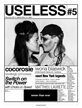
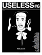 USELESS
Tabloid-sized
B/W, newsprint
$8
New York and London-based art mag Useless has the old school enthusiasm of ye olden music fanzines like Search and Destroy or MRR. Maybe it's the newsprint or that interviews, profiles, reviews, events and ideas are really packed in here—sometimes there'll be up to four different things on one spread. I love that. I got issues 5 and 6 at the Art Book Fair and still haven't come close to reading every word in them. I've opened up each issue on several occasions and flipped around, reading a bit of this and a bit of that. The issues have themes and, according to their site, the format of the magazine can/will change based on that. Issue 5's theme is "newer than ever" and my most favorite thing in here is a story called Legends of New York where Useless asks four fantastic old school New Yorkers to talk about NYC then, now, and 100 years into the future. Issue 6 is called "there you are" and has a Donald Urquhart drawing on one cover and Todd Haynes on the other. This issue has many highlights, including Joan Jonas, Ann Magnuson, Todd Haynes, Molly Shannon, Dirty Martini, our friends' band Golden Triangle, a random picture of another friend of ours kissing someone, etc etc. I was lying on the floor reading these issues with a friend the other night and we were talking about hype and pr and how underground mags are really no different than the big glossies. Big magazines mostly write about the same people at the same time because they have a movie out or a record or something like that. Cool small magazines do it too but just on a more indie scale. It's tiring. Useless has a little of that, I think, but not too much. I feel like they cover so much and such a wide array—from major names who've been around for years, to people you hear about these days, to people you've never or barely heard from. Well played, dudes.
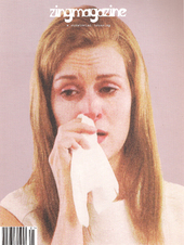 Despite large spans of time between issues, bouncing email addresses, and an ancient website, I just knew zingmagazine would stick around and keep printing. A week or so ago I got an email saying they were sponsoring a party at Art Basel Miami...I thought, hm, promising. Then yesterday, at Spoonbill, I saw a big huge shiny new issue wrapped in plastic and containing a cassette tape and cd. After researching further, I see the issue isn't all that new and the launch party was in the Spring. Either I'm out of it of they're having distribution problems. I'm pleased to note, in the launch party pics, that zing publisher Devon Dikeou is still making those delicious pies for her parties.
Zing issue 21 (2006/2007) is good, and huge. I am, however, sad to say that this issue is free of reviews. I am addicted to reading reviews and the zing reviews are great: a mix of straightforward show reviews and reviews of places or events or objects—like our friend Emma's review of Dairyland and other toxic sites in New Jersey in issue 20. I get the idea the reviews section isn't heavily edited, if at all, and I like that. Each one is totally in the voice of its writer, awkward moments and little mistakes included.
Anyway, back to the present... Issue 21. All curated projects. Zing favorite James Fuentes curated the cassette tape, a sound project by Jonas Mekas recorded at Andy Warhol's funeral mass at St. Patricks. I'm looking for a Walkman I can borrow to listen to it. Photographer and zing's ad director Grace Kim's photographs of the Explorers' Club gala at the Waldorf Astoria are creepy beautiful. So far my favorite thing in here is Gay Sex in the 70s, an amazing selection of Tom Bianchi's photos from the 70s. The reasons I'm obsessed with this moment in porny photography are all here: the colors, the appearance of body hair and normal looking muscles, the poses, the gestures, the suggestiveness rather than the completely explicit, the close crops, the playfulness. Also I like Lee Stoetzel's constructions of McMansions, Craig Rember's abstract photographs, and the photographs of pages from BLAB!, an annual comics anthology.
Zingmagazine costs $20 and is available at a select few magazine and bookstores. For a list of places to buy zing, go here. Oh, and ps., on the accompanying CD the last song is that Colin Newman song "Alone" which you may recall from Silence of the Lambs. I also quite like the first song, "Brannocks Last Stand" by Serious Weapon.
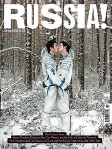 Russia!
New York and points beyond
8.5 x 11 in, 130 pages
Full color
$4.99
Have you ever noticed magazines will often have intriguing covers, but when you open them up, either they are really bad, or more of the same bullshit? On first seeing Russia!'s kissing (male) cosmonauts this crossed my mind. I wasn't too sure about the type face of the logo either, as it seemed a bit corny to me. I quickly flicked through, and still wasn't convinced, so it went into the black hole of my magazine desk pile.
Fortunately it fell on the floor a few days ago and I started to read it. The type, which had at first seemed awkward to me, began to make sense the more I absorbed it. This was due in no small part to the excellent writing, which was playful without being snarky, and highly informative about a subject matter I previously hadn't known I was interested in.
Russia! is an English language magazine based in New York promoting Russian art, design and literature to the global community. The design of the magazine is thoroughly modern, though it shows an appreciation for general 19th century design, and (actually) just a bit of Russian design. I still think it's a bit rough, but I like where it's going. The Winter 2008 issue features lighthearted looks at Russia's bribery economy, obsession with conspiracies, space tourism and controversial art.
I'm reminded of Tokion, which began as a magazine to promote Japanese culture to the world, but quickly degraded into just another New York lifestyle magazine. Hopefully Russia! will stick to it's guns (although, with it's title, does it have any other choice?).
 What do I love about magazines? I think a few people might think it's typography and design, but my Print Fetish isn't specifically about design - it's about print, about the art of editing. I'm not interested in a magazine that utilizes inventive layouts or pristine typography if those elements are not completely conceived and utilized to support the point of view of the editorial whole. Point of View is the most important aspect of a magazine, and if a magazine lacks point of view, which most seem to, I could care less about the design.
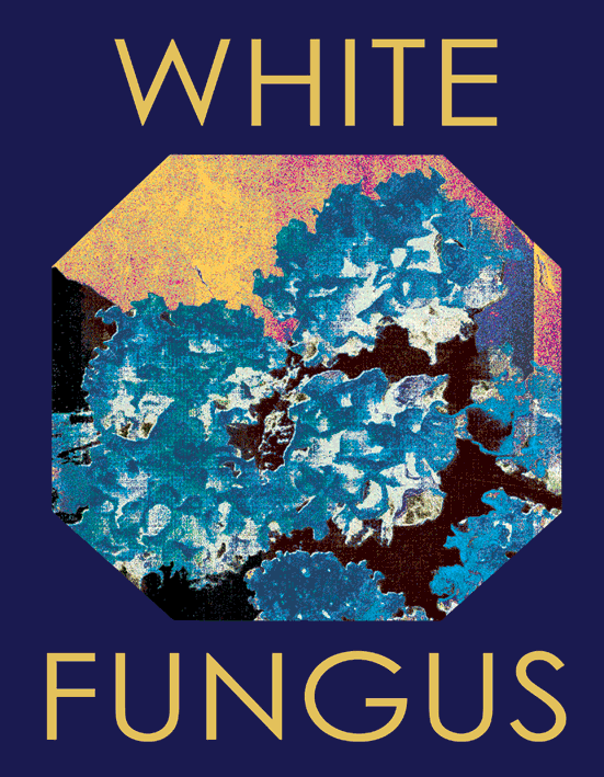
How wonderful then is it to find New Zealand zine (or magazine), White Fungus, which has a wonderfully independent, funky yet thoughtful point of view. White Fungus is an art and literary (and sometimes political) zine that gives you writing and art work you aren't expecting. Although many magazines espouse their mission of promoting talent and giving voice to those "outside the mainstream" who "go unnoticed" (God... HOW many magazines have written about or done interviews with Daniel Johnston? Give me a break), White Fungus actually delivers. Without all the absurd mission statements and press kit boloney.
Genuine interest in the subjects and art works presented is what makes White Fungus an interesting read. It really balances the slightly punk enthusiasm of its look and voice with superb editing. This is what I personally love to see - a magazine that utilizes non-corporate, irreverent aesthetics (design and writing), yet maintaining high language standards and classic (maybe old-fashioned) typography. The attention to detail and standards never get in the way of the fun, and although this is an "art" zine, it is far from the sterile and humorless voice of most art magazines. In many ways it's like the editors took the best aspects of Cabinet, Zing and Butt and squished them into White Fungus.
White Fungus #9, the first issue available in the U.S, features artwork by Richard Killian, Yao Jui-Chung, Hye Rim Lee and Tim Bollinger. Writings on Terrence McKenna, the end of art history and a conversation with sound artist and composer Annea Lockwood. I particularly enjoy the opening feature on New Zealand historical figures, and this issue Jane Janesly writes about Chew Chong, a chinese immigrant to New Zealand in the mid 19th Century.
This is absolutely the best magazine anyone has sent to me at Print Fetish, so definitely go find it.


During Butt Magazine's early years they had a companion zine, a sisterly counterpart, called Kutt. It was started by their friend Jessica Gysel. She put out a few issues of Kutt and then seemed to disappear, only to resurface a few years later with the fantastic Girls Like Us magazine. Ultimately, Girls Like Us is the better mag--more fully realized, existing on its own rather than as a version of Butt, etc. Regardless, the issues of Kutt are still totally good, if you can find them... I had been looking for ages before I finally found a single copy of issue #3 at St. Marks Books.
Continue Reading PF Collection: Kutt

I find that actually, if you know about one, you usually don't even know that the other exists. Both do curated, limited edition projects incorporating interesting packaging, printing and/or accompanying objects. Arkitip is usually very affordable (the current issue is $25.00) while Visionaire's price is a bit extreme ($295.00 for the current issue), which is specifically meant to express the magazine as "luxury" item. But which is more successful creatively? Maybe your choice depends on what your aesthetic is - if your a fashion person, an art world person, a street art person?
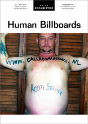 Roomservice: Magazine About Real Life Transactions
100 pages, full color, perfect bound
170 mm x 240 mm
€15
I particularly love magazines with a strong concept from which all of its content revolves around. When all choices are made based on their relationship to the central concept, a magazine becomes a unified whole, even though it contains a wide diversity of contributions. This is the real art of magazine making. I also love magazines that feature people who aren't famous - because fame isn't enough to make someone interesting. Found and Butt are two favorites because they exemplify these qualities and so does the new Dutch magazine Roomservice created and designed by Jacco Kranenburg. Issue one is a collection of the magazine's winning bids on ebay auctions of human billboards. Through auction descriptions and photos of sellers displaying their Roomservice advertisements, we get a fascinating glimpse into the lives of strangers.
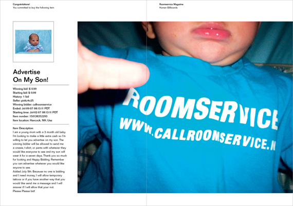
Roomsevice is an intriguing example of the possibilities of internet/print symbiosis. It has the democratic and accidental qualities of the net contained in quality editorial arrangement.
See Also: Jacco's interview at Gym Class
Roomservice is available on their site
Categories
- Archive
- Art/Design Magazines
- Books
- Car Magazines
- Comics
- Entertainment Magazines
- Events
- Fashion Magazines
- Flyers
- Food Magazines
- Gallery
- History
- Home/Architecture Magazines
- IN BRIEF
- Interviews
- Lifestyle Magazines
- Linkophelia
- Literary Journal
- Magazine Rack of the Week
- Magazines We Love Roundup
- Make Your Own
- Objects
- PDF magazines
- PF Collection
- Photography Magazines
- Places
- Posters
- Ramblings, Rants and Redundancies
- Resource
- Small Press
- Special Issues
- Travel Magazines
- Websites
- Zines-Handmade
- Zines-Printed
follow us
blogs we love
small press