Lifestyle Magazines Archives
Prince in talks 2 develop music magazine for U. It also says the mag will feature the purple one's photography! I can't wait to see.
 Here are some links to a few full issues of awesome LA new wave magazine WET. This one is from 1981 and features side by side interviews with Johnny Rotten and a young David Lee Roth and some great stuff on xerox art. Plus the whole thing, even the ads, looks amazing. This page has two issues from 1978 up on their site. And this page has a cover gallery.
[from ryan, via boingboing]
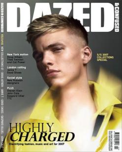 Last night I found myself short on cash when it was time to pay the dinner bill so I slipped out into the snow storm in search of the nearest deli ATM. The deli I found, somewhere on Dekalb Ave. in Brooklyn, had a fantastic magazine selection including a few titles I've never seen before. My dinner companions probably figured I'd skipped out on the check, I was gone so long looking at shelves of new mags. I left with a pot leaf lighter and the February 2007 issue of Dazed & Confused. I'd forgot about Dazed and probably haven't read it in a year or two. I'm glad I got reminded. This is a good issue! I always feel like I learn something after reading an issue. There's a John Cage interview, an article on the Doug Aitken video piece at the MOMA (which my history of video art teacher called a giant Gap ad), a look at the spring/summer 2007 collections, and a really foxy French guy I've never heard of. The Dazed Digital site already has the March issue up, so go grab Feb off the stands before it goes away.
 Once a week or so I meet Mr. Mcginnis at Universal News for coffee and magazine browsing. We each grab a stack of titles we've never looked at or maybe haven't seen in a while and then sit down and discuss. There were a few highlights this Friday but nothing really blew me away. The only thing I was psyched about all through the issue was Lula, and that doesn't count because it wasn't a magazine I'd never bought before. More on that issue later. Here's what else I saw:
Encens: a French/English fashion magazine. I liked that most of the book was in black and white and that they used a few different kinds of paper. Also, did you know that LA fashion designer Rick Owens makes furniture now? I guess I've been a little out of the loop.
032c: a bi-annual German contemporary culture magazine with good articles but not the best feeling paper. I also liked the cover.
Very: a New York/London art and fashion mag that also publishes style guides to various cities. Glad to see they're still publishing. The best part about them has always been their great covers. The paper also feels good.
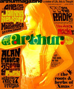 There are two free, American cultural zeitgeist magazines that have been around for the last few years. One represented tacky rudeness mistaken for irony, while the other actually strived to be positive, represent the unsung and spread useful information. One has ushered in the marketing category of "hipster," where middle class suburban refugees holding cans of Pabst Blue Ribbon can buy into "alternative" culture while still being sexist, racist, homophobic and greedy as fuck. The other free magazine, Arthur, made you believe that there was still hope for our generation. Unapologetically anti-war, nerdy and a bit hippy, Arthur never confused it's mission with simply existing to sell ad space.
I feel saddened and defeated with the recent news that Arthur, the BEST national free magazine, has folded. I felt that Arthur was on a trajectory to being better and more popular than ever, but the founders, editor Jay Babcock and publisher Laris Kreslins, have had a falling out about the future of the magazine. Kreslins has removed Babcock's final message about the folding, asserting that the magazine is simply on hiatus - but without Babcock, Arthur is indeed dead.
What Others Are Saying:
Arthur Mag Calls It Quits - Village voice
Future of Arthur Magazine looks bleak - LA Times
Disinfo on Arthur's Demise
silver in sf
 I snatched the February issue of Paper Magazine from a pals end table - WTF!? What has happened to Paper? I realized when viewing the cover that the reason I stopped buying it was simply because I never see it anymore - the logo is practically invisible. And What the HELL is with putting mall-punk poster boys Good Charlotte on the cover!? Inside the mag this insipid group is referred to as once being "underground."
Paper might be the main reason I moved to New York years ago because It created such a powerfully romantic notion of NYC "Downtown." Their taste was flawless, they championed new (and often outrageous) talent and were wonderfully playful. Paper was the first American magazine to reconcile the once polarized notions of "punk," art and fashion - in other words, it was pretty gay.
After reading this issue (and considering other issues I've seen recently), I wouldn't say that Paper has "sold-out," they've simply lost their passion. I think David and Kim (both editors and publishers) are still very cool people, but their magazine has become wishy-washy and disenchanted with New York. Kim has complained in the past that she can't find the freaks in NY anymore - but I wonder if she remembers how to look for them.
For the last few years Paper seems obsessed with how much more interesting LA is than New York. However, the "interesting" LA people profiled in "The 2nd Annual Paper Project Los Angeles" seem pretty boring. Not that they ARE boring, they just seem that way because the magazine hasn't done a very good job making them seem larger than life like they once did with the NY Downtown Stars. The photos and writing are devoid of color or enthusiasm. Also, the design of the whole mag is just plain and irrelevant. Dull, dull, DULL.
Paper was originally meant to be a Downtown New York magazine. "Downtown" as an aesthetic and ideological focus is disconnected from the original intention. "Downtown" is no longer a vibrant, cheap neighborhood at the forefront of creative culture. Paper doesn't even think so. Perhaps moving to LA might reinvigorate them.
 I picked up the second issue of Fabien Baron and Glenn O'Brien's Interview, with Marc Jacobs on the cover, and let me tell you... Interview may just very well be back. I was immediately pulled toward it on the shelf at St. Marks books because it lacked the irritating, typical and excessive cover lines which pollutes most American magazines. I was also pleased to see that actual art direction was taking place on the cover, as well as inside.
In a desperate bid for survival, Interview joined the cover-line arms race toward stupidity. Concept fell to the forces of project hype and too much control from people in marketing and celebrity agent negotiations. The magazine, once the most fabulous indicator of everything interesting about the pop and art world, had slid into the celebrity hole in an attempt to compete with drivel like Entertainment Weekly an Us Magazine. As far as I can tell... the night freaks, downtown icons and art world hadn't been reading Interview for years, but it looks like Baron and O'Brien are set to bring Interview back into the hands of Warhol's children.
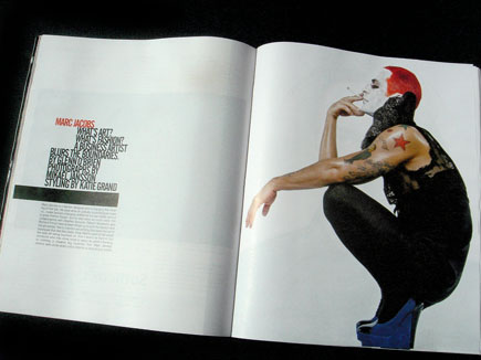
This isn't the official re-design or re-direction of the magazine, just a taste of things to come, according to Baron. The look has been stripped down and emboldened with typography that is extremely well executed. The overall content isn't yet completely satisfying, probably due to stories that have been brewing since before the new team. But the "80th Warhol Birthday" section featuring Warhol memorabilia, superstars and the reflections of 14 contemporary artists (presented with typography that is arranged in a very painterly manner) is quite beautiful. This section alone is worth the ity-bity $3.50 cover price.
I'm excited to see what they'll be up to. The June issue is out now in the U.S
Categories
- Archive
- Art/Design Magazines
- Books
- Car Magazines
- Comics
- Entertainment Magazines
- Events
- Fashion Magazines
- Flyers
- Food Magazines
- Gallery
- History
- Home/Architecture Magazines
- IN BRIEF
- Interviews
- Lifestyle Magazines
- Linkophelia
- Literary Journal
- Magazine Rack of the Week
- Magazines We Love Roundup
- Make Your Own
- Objects
- PDF magazines
- PF Collection
- Photography Magazines
- Places
- Posters
- Ramblings, Rants and Redundancies
- Resource
- Small Press
- Special Issues
- Travel Magazines
- Websites
- Zines-Handmade
- Zines-Printed
follow us
blogs we love
small press