Fashion Magazines Archives
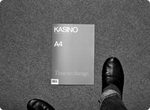 I ventured out in the freezing weather last night looking for something to look at. I was bored, I guess, and that rarely happens. I walked around Union Square but it was too cold to really see anything except my breath and my hair blowing in front of my eyes. I read magazines in Barnes and Noble for a while but sometimes being in there gives me the creeps and I didn't feel like having a Starbucks coffee and gross muffin. So I wandered over to Union Square Magazine Shop hoping to find some weird little mag tucked between the bigger ones. Big New York newsstands are good for that kind of thing—well-stocked and disorganized enough to harbor hidden treasures. And this time was no different. I left with a slim volume of Kasino A4, a black and white Finnish fashion/art rag with a nice purple cover. This issue also has a middle section printed in blue and white. It looks like it was made with a ditto machine. I've always wanted one of those. And this magazine kind of smells like that mimeograph smell. I love that. I'd say this is the best smelling magazine I've bought this month.
On the cover it says simply "Time to change." The unifying message of this issue seems to be slow down, take a good look around—at yourself, your home, your people, etc. I suppose that is appropriate for a Winter issue. Throughout the issue there is documentation of the mag's editors showing up at the apartments of artists they're profiling and cooking a meal with whatever that artist has in their kitchen while doing an informal interview. I love this too.
Their new issue is sold out from the site, but look for it at cool shops and newsstands. You can get back issues and posters and t-shirts from their site though.
 I'm all into this magazine today. I woke up and was checking my email/myspace/etc and saw a bulletin from them about a party which prompted me to go look at their site. I know I have a copy of Issue #1 around here somewhere but I can't find it. From what I remember, I liked it. They have a new issue coming out this month and I'll definitely look for it. You can look at spreads from the past two issues on the site and also buy some cute clothes.
Continue Reading THE END!!
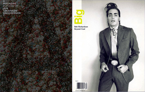 I love when magazines have guest editors, when they let a person or a collective curate the whole issue. Some of my favorite examples are: Big Magazine 15 by Bob Richardson had old and new photos by Bob, features on new designers he liked, photos by his son Terry Richardson, and old pics from Bob’s life, like a spread of him hanging out with a teenage Angelica Houston. The issue of A Magazine curated by Maison Martin Margiela had a white theme, began with this quote, "the past is what bonds us, the future leads us," and had pages by everyone who has ever collaborated in any way large or small with the fashion house.
Continue Reading Guest Editors
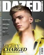 Last night I found myself short on cash when it was time to pay the dinner bill so I slipped out into the snow storm in search of the nearest deli ATM. The deli I found, somewhere on Dekalb Ave. in Brooklyn, had a fantastic magazine selection including a few titles I've never seen before. My dinner companions probably figured I'd skipped out on the check, I was gone so long looking at shelves of new mags. I left with a pot leaf lighter and the February 2007 issue of Dazed & Confused. I'd forgot about Dazed and probably haven't read it in a year or two. I'm glad I got reminded. This is a good issue! I always feel like I learn something after reading an issue. There's a John Cage interview, an article on the Doug Aitken video piece at the MOMA (which my history of video art teacher called a giant Gap ad), a look at the spring/summer 2007 collections, and a really foxy French guy I've never heard of. The Dazed Digital site already has the March issue up, so go grab Feb off the stands before it goes away.
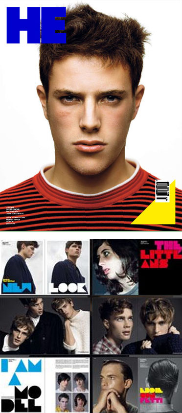 Touring Universal News I discovered a men's fashion magazine that really came out of nowhere - Denmark's He Magazine. I don't mean to disrespect the Danes; what I mean is that I'd never heard of it advance, and it seems to be a completely independent magazine made by a group of twenty-somethings. I couldn't find any information online about it's launch - nor any information on it's editor-in-chief Daniel Magnussen (other than a sparse Myspace profile that gave his age, 26) or Art Director Jack Dahl (other than an empty website for his design studio, Homework).
The bold title, stark photography and direct gaze of cover model Antoine commanded attention on the rack - and I always grab fashion magazines that lack cover lines. My first impression was that I-D had taken Dazed & Confused/Another Magazine's lead (which started Another Man last year) and started a 'brother' magazine. Indeed, the art-directon has a lot in common with the British mainstay - uncluttered san-serif typography, clean, blocky layouts, bold photography obsessed with hip youth culture and pretty boys. The chunky, colorful headline type seems to reflect this seasons fashion trends as they see it - playful, comfortable and future minded as emphasized in their spread of Raf Simons current collection. This is a true fashion lovers magazine, and a magazine lovers magazine. Highlights in their 3rd issue include profiles of the Acne team and an insightful interview with the amazing Ann Demeulemeester. Don't worry, it's in English. The big question I keep asking myself is how the hell did they pay for this luscious production?
 Once a week or so I meet Mr. Mcginnis at Universal News for coffee and magazine browsing. We each grab a stack of titles we've never looked at or maybe haven't seen in a while and then sit down and discuss. There were a few highlights this Friday but nothing really blew me away. The only thing I was psyched about all through the issue was Lula, and that doesn't count because it wasn't a magazine I'd never bought before. More on that issue later. Here's what else I saw:
Encens: a French/English fashion magazine. I liked that most of the book was in black and white and that they used a few different kinds of paper. Also, did you know that LA fashion designer Rick Owens makes furniture now? I guess I've been a little out of the loop.
032c: a bi-annual German contemporary culture magazine with good articles but not the best feeling paper. I also liked the cover.
Very: a New York/London art and fashion mag that also publishes style guides to various cities. Glad to see they're still publishing. The best part about them has always been their great covers. The paper also feels good.
 Lula
Lula
Girl of My Dreams
200 pages, full color
$14.99
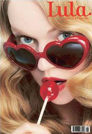
Lula magazine is a newish British fashion magazine started by Becky Smith and Leith Clark, ex-Vogue people. I like it! Everything in it has such a great girly energy. They mix art and fashion stories well and I'm so psyched that they have so many illustrations. It's full of dreamy photo shoots which feature designers both major and small and thankfully has none of that annoying front of book round-up type of pandering to advertisers stuff that so many other girl-y mags fill up with. I like the way they package a story. For example, in issue #4, there's a big feature on tap dancing which includes a pull out poster with actress Zooey Deschanel demonstrating a tap dance she made up, a fashion illustration story accompanied by text from actress Michelle Williams about her love of tap dancing as a child, photos of girls tapping, and an essay about how all girls love tap dancing. I couldn't have given a crap about tap dancing as a kid and was only interested in skateboarding and book reading but the genuine sweetness and enthusiasm of this piece is contagious. At the end I'm like tap dancing is rad! The whole magazine is like that. It's beautiful. It's cute—and in a fun, exuberant kind of way, not in a cloying fakey sort of way. Flowers, fruit prints, lacy things, lots of sun, an office dog on the masthead, jewelry, sparkly things, and almost no boys anywhere. It gives me an excuse to get in touch with my inner girly-girl (I swear I have one!). Also in issue #4 is a story on Erin Fetherton's fairy princess-like collection shot by Ellen Von Unwerth. I like her. I also like the Sonia Rykiel headbands I saw in another story. So cool! I want them all. My only real complaint is the magazine is too white. Almost every story uses skinny white models and actresses.
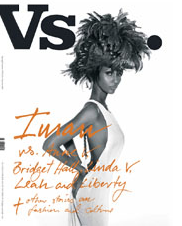 I have a tendency to gloss over while looking through the fashion section at Universal News. There are so many enormous European fashion magazines and I can't tell most of them apart. The stories all kind of blend together and I find myself unable to remember anything specific about each issue. But Vs. Magazine, also a large fashion, etc. mag from Europe, rises above the rest. The stuff they cover isn't that unique: fashion designers, rock bands, an actor or two. So what is it that makes Vs. so good? Well, first of all, the photography is just fucking gorgeous. And I think what really makes Vs. different from its peers is the maturity of its content. You get the feeling that everything is well-considered—the section of interviews in the middle of the book is printed on matte paper and all the photos are black and white. They're smart. They are enthusiastic but not spazzy. They have a clear voice and they stick to it.
Pages from the current issue (I believe its their 4th), after the jump...
Continue Reading Vs.
I think the best magazines have a strong personality in control - of course, a strong personality can also make a magazine very bad. I'm utterly fascinated to see The September Issue, a documentary about Anna Wintour as she puts the fall fashion issue of Vogue together. American Vogue is an example of someone who has hacked their way into a position of power - but with little editorial (written) skill or any real art or fashion insight. She was never cool or ever fierce. Just a spoiled rich kid with an accommodating daddy (another clue to her success - she understands the Vogue readers who can afford the fashion all too well). Basically, it's all through the force of her personality that she bludgeons out a magazine. That's her only skill - BELIEVING in herself to the point that everyone else believes in her as well. She is a shining example of the power of self-confidence and delusion. It CAN make you successful - see this film and learn it well.
In the trailer she expresses an inane observation on a type treatment - which is very telling, since the type is so outrageously bad in Vogue - maybe the worst of any major (selling) magazine. Watch the process of how all the skills of designers, writers and photographers are crushed into the dust with a pointy heel - fashion crush porn!
Categories
- Archive
- Art/Design Magazines
- Books
- Car Magazines
- Comics
- Entertainment Magazines
- Events
- Fashion Magazines
- Flyers
- Food Magazines
- Gallery
- History
- Home/Architecture Magazines
- IN BRIEF
- Interviews
- Lifestyle Magazines
- Linkophelia
- Literary Journal
- Magazine Rack of the Week
- Magazines We Love Roundup
- Make Your Own
- Objects
- PDF magazines
- PF Collection
- Photography Magazines
- Places
- Posters
- Ramblings, Rants and Redundancies
- Resource
- Small Press
- Special Issues
- Travel Magazines
- Websites
- Zines-Handmade
- Zines-Printed


