 Everyday I scream, "DESIGN OBSERVER IS BORING!" Do we designers hope that something will rub off on us if we keep reading these lackluster established designers? Do we believe that their list of credentials and validation by (boring) publications and (boring) big-time clients somehow imbues them with talent? Why do we doubt our own taste, only in the presence of these professional mundanities?
The truth is most designers are actually very unimpressed by the work of the American branch of Pentagram, the design of Print Magazine (or it's writing), or Design Observer - yet we continue to keep our mouths shut and/or idolize them in the hope that we can join them on their towering pedestal of well-paid mediocrity. We want to join their fuck-me-for a job mob. It's not like I would ever turn down a job that a pal that I went to school with offered, but I will NEVER confuse that with what is of actual quality, and I will never measure my success by this bullshit validation. The point is.... I stopped reading Print, and now I am taking Design Observer out of my bookmarks. I can no longer help these people make a profit. I am not particularly against capitalism, I am just for quality.
These old posts from my dead blog kind of flesh out these thoughts a bit more.
From The Vault: Monday, June 07, 2004
Print Needs To Actually LOOK At Some Print
I bought the gorgeous issue #13 of McSweeney's and the new issue of Print. McSweeney's, which is hardcover and beautifully printed, cost $17 - and Print, which is a pretty average looking normal magazine, cost $20! That's fucked up, especially given that Print has more distribution and more actual copies printed up. So why are they so greedy with their price? God, the paper isn't even particularly nice. Jerks.
Print is normally something I read at the library - it often has good articles, but it's too expensive for what you get, and I hate supporting them. But the May/June issue is the European Design Annual and has a beautifully embroidered cover by Andrea Dezsö.
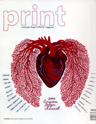
I'm usually more impressed by European designers, so I thought I'd see some good stuff - and read some informative articles. But no. Obviously they chose to showcase work that looked like bland, American commercial design. Do these people actually look? There is some impressive work, but it's not really an accurate picture of European design; It's a picture of what American's think is good design. The European Design Annual was invitation only! I call bullshit on that. More proof that there is no such thing as objectivity, only the pretension of being objective.
A designer must think in a certain way, and pull back his creative instincts to make a living. I accept that. But too many designers begin to think of that pulling back as the benchmark for quality. They begin to think that that is THE WAY. It's not THE WAY, it's the way to make a living - there's a difference. So please, young designers, read Print - but take it with a grain of salt. It's like the Oscars.
There is also an article in Print, by Steven Heller, art director of The New York Times Book Review, on design blogs. While reading it, I had the feeling he was talking about ME!
"Yet Accessibility has it's downside: Some bloggers simply post to see their words in type - like being smitten by the sound of their own voices. I've come across so much blathering on blogs that I still put more credence into the accountability of an edited magazine or journal..."
Steven. I totally agree with you. I am definitely guilty of gross self-indulgence - but I love gross self-indulgence. A blog is just the modern version of a 'zine - and what makes 'zines great are a lack of professionalism, pissed-offness, and self-indulgence. A zine and a blog are like a person's home - it's the perfect time and place for self-indulgence. Anything less or more would be dishonest, boring and detrimental to real communication and self-expression. It has to be at least somewhat RAW, or it's pointless. As I've repeatedly stated before, I don't believe in objectivity. I respect that at least a self-indulgent blog is honest about its lack of objectivity, while a "well" edited magazine is not. An informed reader must wade through the lie of objectivity to create his or her own picture. And no one is guiltier of this lie than The New York Times and Print.
Now that my self-indulgent bitching is through, I will say that there was an article on one of my favorites, Swiss designer Ralph Schraivogel. It's not a particularly insightful article (here I am bitchy again) - but it's a good introduction to his work.

However, $20.00 is a bit much to pay for a skimpy introduction, when you can pay $14.00 to buy an actual book which collects many of his beautiful posters.

Don't buy Print - just read it in the library or find it in a bundle on the sidewalk (thats how I first discovered it).
From The Vault: Monday, August 23, 2004
Vanilla Print
I bought the latest issue of Print, which is the "sex" issue, because I'm a sucker for that topic. It was a moment of weakness, and I thought, for some unknown reason, that they were going to discuss the design of pornography. Apparently even broaching the subject is offensive to some people. The only thing that offended me is how squeamish and tepid it was. I mean, the cover wrapping would only be clever if there actually was graphic graphic content inside, which there wasn't.
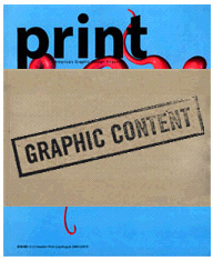
I don't think they went far enough at all. They didn't discuss the quality and relationship of design to the sex industry in depth, or discuss good design instances in the sex industry. Sexually charged commercial imagery is discussed - but real pornography would have been infinitely more interesting and original.
There is a decent article on Playboy's poor design by Ted Allen and a review of the fabulous new book X-Rated: Adult Movie Posters of the 60's and 70's which is highly condescending and hardly illuminating. However, for the most part the issue deals with the tired discussion of pornography's influence on popular media, such as in Rick Poynor's article "Designing Pornotopia." Needless to say, his article has nothing to do with the design of pornography. Instead all we have is an ambiguous moral argument against the objectification of women and a pronouncement of boredom. He quotes (shudder) Andrea Dworkin, and though he states that she's a bit extreme, one feels his empathy for her. Dworkin, in her 1981 book Men Possessing Women claimed that (I'm paraphrasing her) pornography was rape, and that even two gay men having sex in a porn was tantamount to raping a woman, because (!!!!) one partner was the submissive and therefore the feminine representative.
Gay men are a problem when one over simplifies the tendency of men to objectify as a bad thing. We show that objectification isn't limited to women, and isn't motivated by a lack of respect for women. Men objectify and enjoy visual representations of sex and nudity; gay men exalt in this unashamedly amongst one another (A gay man rarely hides his porn collection if a date comes over.) We don't mind being objectified. Gay men, as stylists, photographers and designers have been highly influential in the heightened sexual imagery in fashion magazines and advertising - which Poynor seems completely unaware of. In fashion, they show their love for the beauty of objectification using clothes and woman. There is a connection between advertising, fashion and porn - and gay men were the first to ironically present it. This unapologetic objectification and irony in gay men's work has influenced all of popular media and in turn heterosexual men and women's feelings about objectifying and being objectified. The concept of objectification as it relates to graphic design is the ripest subject here, but remains unexamined in Poynor's piece.
This illustrates an even larger problem with Print - it rarely deals with how particular impulses motivate a designer to certain aesthetic choices. That is to say, it is rarely about design at all; it is more often about the subjects that design presents, only superficially dealing with the nature of design itself. Further, the depth and timing of Print dealing with these subjects is very poor. Poyner discusses The Face and Sleaznation as examples of explicit sexual imagery in popular media, and while both magazines are "guilty," they have already discussed the issues Poyner broaches years ago, with much more humor and less cowardice than Print.
One wonders why Poynor doesn't discuss the magazines that have gone much further than The Face did 5 years ago. The bubble was popped long ago and magazines such as Richardson, Nerve, Dutch, Purple Sexe and Butt take for granted that there is no line between art/porn/commerce anymore. They just do their thing.
Categories
- Archive
- Art/Design Magazines
- Books
- Car Magazines
- Comics
- Entertainment Magazines
- Events
- Fashion Magazines
- Flyers
- Food Magazines
- Gallery
- History
- Home/Architecture Magazines
- IN BRIEF
- Interviews
- Lifestyle Magazines
- Linkophelia
- Literary Journal
- Magazine Rack of the Week
- Magazines We Love Roundup
- Make Your Own
- Objects
- PDF magazines
- PF Collection
- Photography Magazines
- Places
- Posters
- Ramblings, Rants and Redundancies
- Resource
- Small Press
- Special Issues
- Travel Magazines
- Websites
- Zines-Handmade
- Zines-Printed


